

Showit Templates for Photographers: How to Choose One That Books Clients
May 27, 2026
published on
filed under

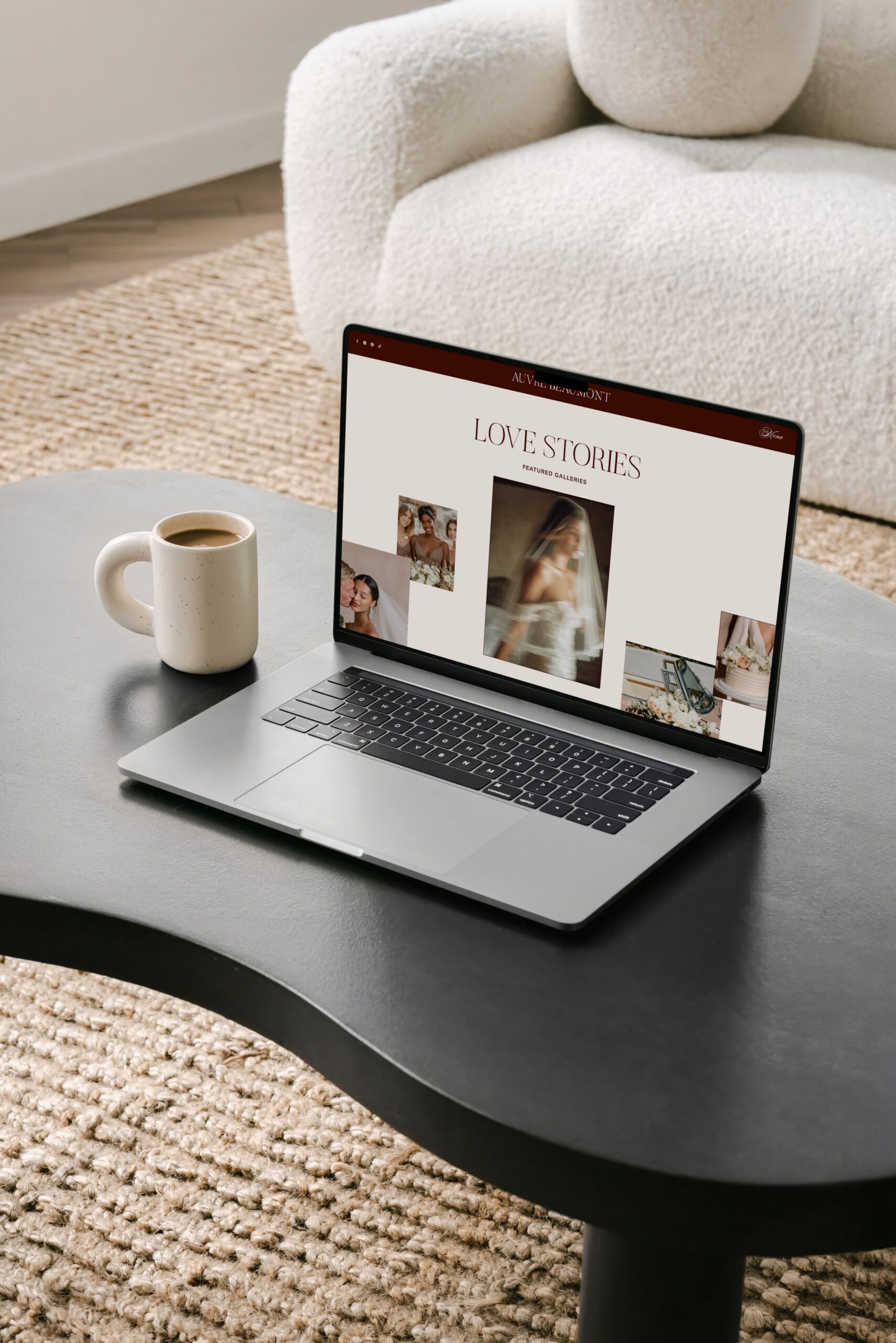
You open one template demo. Then another. Forty minutes later you have fourteen tabs open, a cold coffee, and no decision. The problem with choosing Showit templates for photographers is rarely taste. It is the lack of a framework for telling which beautiful template will actually book clients, and which one just looks good in a demo. This post gives you that framework.
1. Why Showit Works So Well for Photographers
Showit is a drag-and-drop website builder made for visual businesses. There are no rigid blocks and no locked sections. You place images and text exactly where you want them, and the platform pairs with WordPress for blogging and SEO.
For photographers, the real advantage is mobile. On most builders, the mobile version is whatever the platform decides it should be, and your control stops at hiding elements or shrinking fonts. Showit gives you a completely separate mobile canvas, so you design the mobile version independently of desktop without touching code.
That matters because most of your potential clients are on their phones. A template that was designed properly handles both views with intention. A weak one looks polished on desktop and falls apart on mobile.
2. The Real Question Is Not “Which One Is Prettiest”
Here is the mindset shift that saves you weeks of indecision. Fonts, colours and demo photos are the easiest things to change. You will swap them within an hour of buying any template. So judging templates on those surface details is judging them on the part that does not matter.
What you cannot easily change is structure. The order of sections on the homepage. Whether the template has a place for an inquiry-driving call to action. How galleries are built. Whether the layout has room for your services without becoming cluttered.
A pretty template with weak structure gives you a pretty website that does not book clients. Choose for structure first, aesthetics second.
3. What to Look for in Showit Templates for Photographers
This is the evaluation checklist. Run every template you are considering through these five points before you spend a euro.
Mobile design that was built, not auto-shrunk
Always open the mobile demo and tap through it like a client would. Because Showit lets designers adjust canvas height, font settings and element placement independently between mobile and desktop, a good template will feel deliberate on a phone. If the mobile demo looks like a squeezed version of desktop, the designer skipped the work, and you will inherit that job.
A homepage structured to convert, not just display
Your homepage needs a strong hero image, a clear statement of who you serve, social proof, and an obvious next step. A portfolio of images alone is not a homepage. It is a gallery. Look for a template where the homepage guides a visitor toward inquiring.
Room for your services without the mess
If you offer weddings, portraits and brand sessions, the template needs a clean way to separate them. Check that there are enough page layouts and gallery structures to hold your full offer without everything piling onto one overwhelming page.
Galleries that load fast
Large images are the most common cause of a slow photography site, and speed affects both bookings and SEO. Showit recommends uploading images around 300 to 500kb and using JPEGs for best performance. A well-built template gives you gallery sections designed to show your work beautifully at sensible file sizes, rather than full-resolution files that stall on mobile.
Editable without a fight
The best template feels close to finished on day one but stays flexible enough to make it yours. You should be able to change colours, fonts and images quickly, and restructure a section without the whole page collapsing.
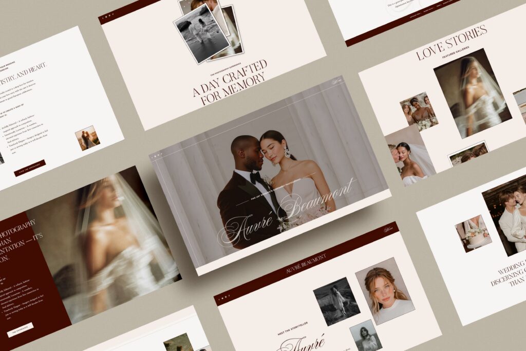
✨ A note on where to start: Both Atelier Jouan Showit templates, Freya Laffleur and Auvre Beaumont, are built on this exact checklist: strategic homepage structure, a properly designed mobile canvas, and editorial gallery layouts. You can see both on the templates page.
4. Matching a Template to Your Photography Niche
Most template roundups assume every photographer is a wedding photographer. You are not all the same, and the right structure shifts by niche.
Wedding photographers
You need galleries that tell full stories, not highlight reels. Couples want to see how you handle a whole day, from prep to reception. Look for a template with room for multiple full galleries and a strong, emotive About page, since booking a wedding photographer is a deeply personal decision.
Portrait, family and newborn photographers
Your work comes in many session types. Family, maternity, newborn, couples. You need a template that separates these cleanly so a visitor finds their session type fast. Structure and clear navigation matter more here than a single dramatic hero gallery.
Brand and personal-brand photographers
Your clients are business owners, and they are buying outcomes, not just images. Your template should have space to explain your process, show before-and-after brand transformations, and speak to ROI. A pure portfolio layout undersells you.
5. Template or Custom: How to Know Which You Need
An honest answer, because the right choice depends on where your business is.
A template is the right call when you are starting out, rebranding on a defined budget, or confident customising design yourself. A good Showit template gets you a professional, strategic site for a fraction of custom pricing, often somewhere between €400 and €1000.
Custom design makes sense when your business has outgrown DIY and needs something bespoke and unique. You are booking consistently, your offer is complex, or your time is worth more spent behind the camera than inside a website editor. A custom Showit site is a larger investment, typically several thousand euros, and it is built entirely around your specific brand and client journey.
Many photographers start on a template and move to custom later. So, it´s really a matter of what you need, your budget and long term goals. If you are unsure which stage you are at, the work-with-me page explains how a custom project works so you can compare it honestly against the template route.
6. Common Mistakes Photographers Make Choosing a Template
Buying on looks alone
The most frequent mistake. You fall for the demo photos and fonts, then realise the structure does not fit your business. Re-read section 2.
Ignoring the mobile demo
If you only review desktop, you are reviewing half the template. Most of your traffic is mobile. Always tap through the mobile version first.
Picking a template too big for your business
A 12-page template with five gallery types is a burden if you offer one service. Empty pages read as unfinished. Choose a template sized to where your business actually is.
Forgetting SEO
A beautiful site nobody finds does not book clients. Showit pairs with WordPress for exactly this reason. Plenty of template choices go wrong long before SEO, and the post on common website mistakes covers the ones that quietly cost photographers inquiries.
7. Conclusion
Choosing among Showit templates for photographers gets simple once you stop judging on prettiness and start judging on structure. Open the mobile demo. Check the homepage guides visitors toward inquiring. Confirm there is room for your services. Match the layout to your niche. Anything beyond that, you can customise.
If you want a template built on this framework from the start, look at Freya Laffleur and Auvre Beaumont, both designed for photographers who want a strategic site without a custom budget. And if your business has outgrown a template, the custom design service builds a Showit site around your brand and your client journey.
Leave a Reply


Brand Photoghraphy by Art inspiration fotografie
Stock Photos by Pexels - Unsplash - Kaboompics - Elévae- Haute Stock Photography - Editorial Stock Images(ESI)

Be the first to comment